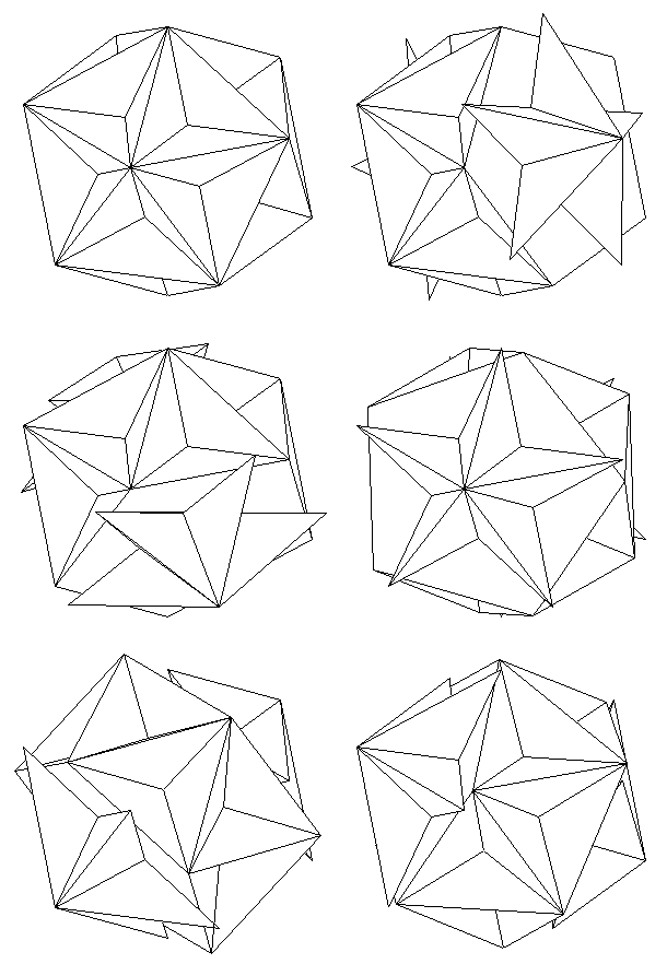
ONE _
found here | thanks to@eiza
_
_
_


TWO _ PARAMETRIC LOGO
« MIT Media Lab’s Brilliant New Logo Has 40,000 Permutations »
The basic idea here is that the logo has three intersecting spotlights that can be organized in any of 40,000 shapes and 12 color combinations using a custom algorithm. That’s enough to supply each and every new card-carrying Media Labber with his very own logo for a whopping 25 years.
source: fastcodesign.com | found via Adolfo Chauton
_
_
_

image above: eat-a-bug.blogspot.com | image below Daniele Sartori

THREE _ VENETIAN GONDOLA
LORENZ LACHAUER (eat-a-bug.blogspot.com of which we had already talked here) explains: « On my last trip to Venice I realized, that the shape of the venetiangondola is not only elegant, but also functional and higly optimized. Developed in the mid-19th-century, the sections of the boat are asymmetric, in order to balance the weigth of the gondoliere, who stands one side of the boat. Referred to the traditional Tramontinshipyard, the geometry of the boat is curved in plan, according to the weight of the oar. »
source: eat-a-bug.blogspot.com | found via @digitag
Interesting Stuff of the week…
4,6K
previous post
